Hey, I'm John, a designer who likes building tools, systems, and products from the ground up

Rechroma

Oklab/Oklch color palette and design system workspace

Rechroma is a project that started as a way to easily generate color palettes and color scales for my studio’s design/dev work. It quickly grew into a full-featured color system product built around the perceptually uniform Oklab colorspace, and had a launch that was featured on Product Hunt.

Rechroma currently features two main workflows: color palette creation and design system construction. The latter, which I named Rechroma Sequencer, builds upon the former since color is a foundational part of any design system.

The color palette tooling includes recommended color palettes (informed by analysis and clustering of real world palette shapes), automatic lightness scale generation, and the ability to export named color tokens/variables to CSS or to Figma via plugin.

Sequencer is currently in active development, and provides a schema and interface to specify/assign tokens for typography, spacing, shape, and more. These are then consumed by a base set of components. The resulting design systems can be output to React/CSS, DESIGN.md, and DTCG formats for use in a project codebase or with AI coding agents.

I also built an mcp server for Sequencer that can generate design systems via agents prompted with reference websites, images, or just a description of the style or vibe you are looking for.
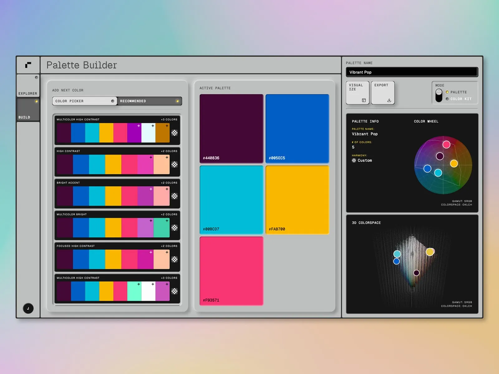
Palette Builder, with recommended palette shapes beside the active five-color palette.
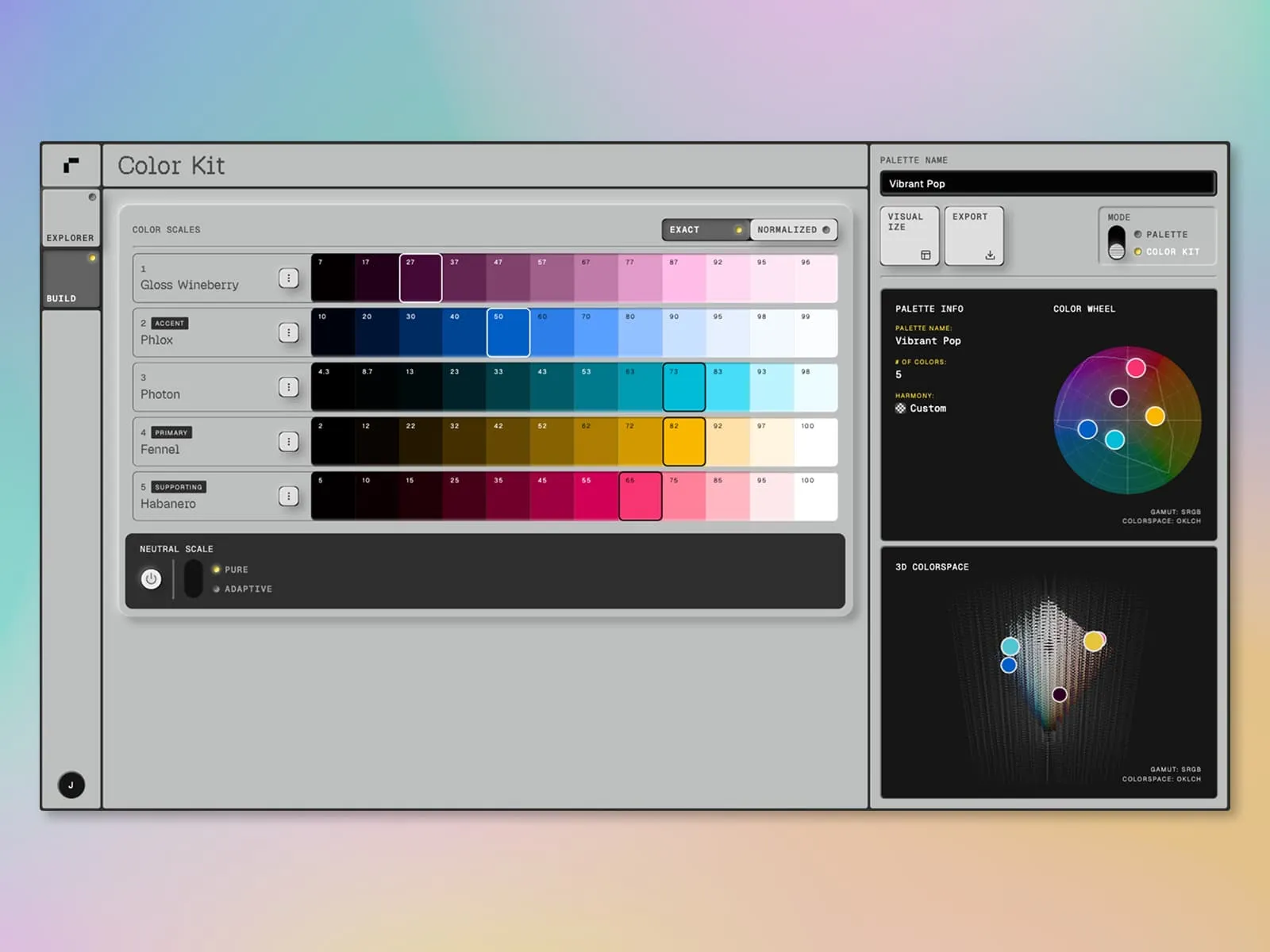
Color Kit, showing the generated lightness scale for each color in the palette.
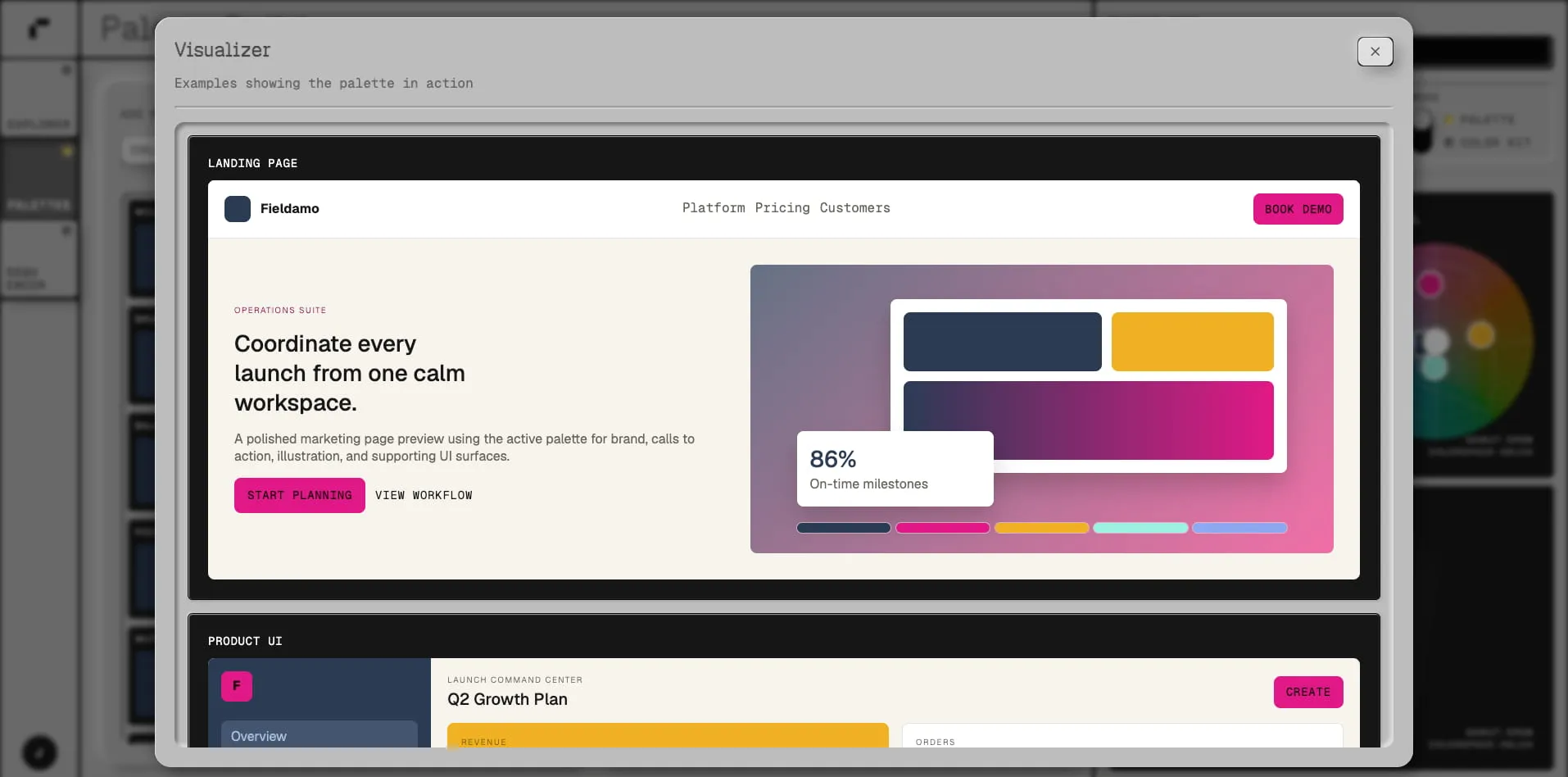
The Visualizer, previewing a palette across a landing page and a product UI.
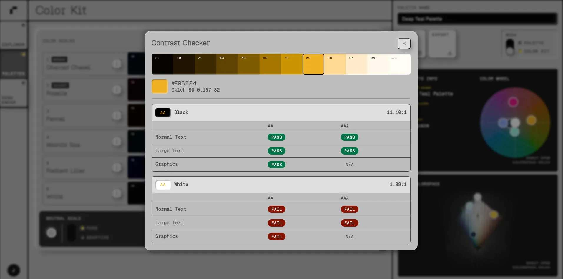
The Contrast Checker, reporting WCAG AA and AAA results for a color against black and white.
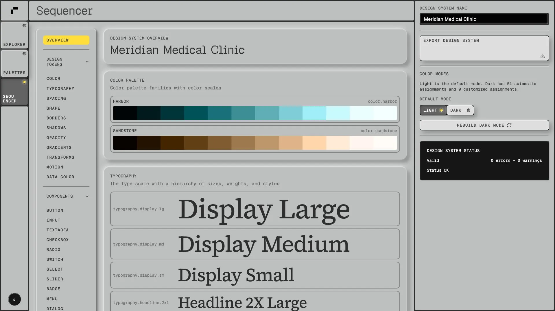
Sequencer's design system overview, with color palette families and the type scale.
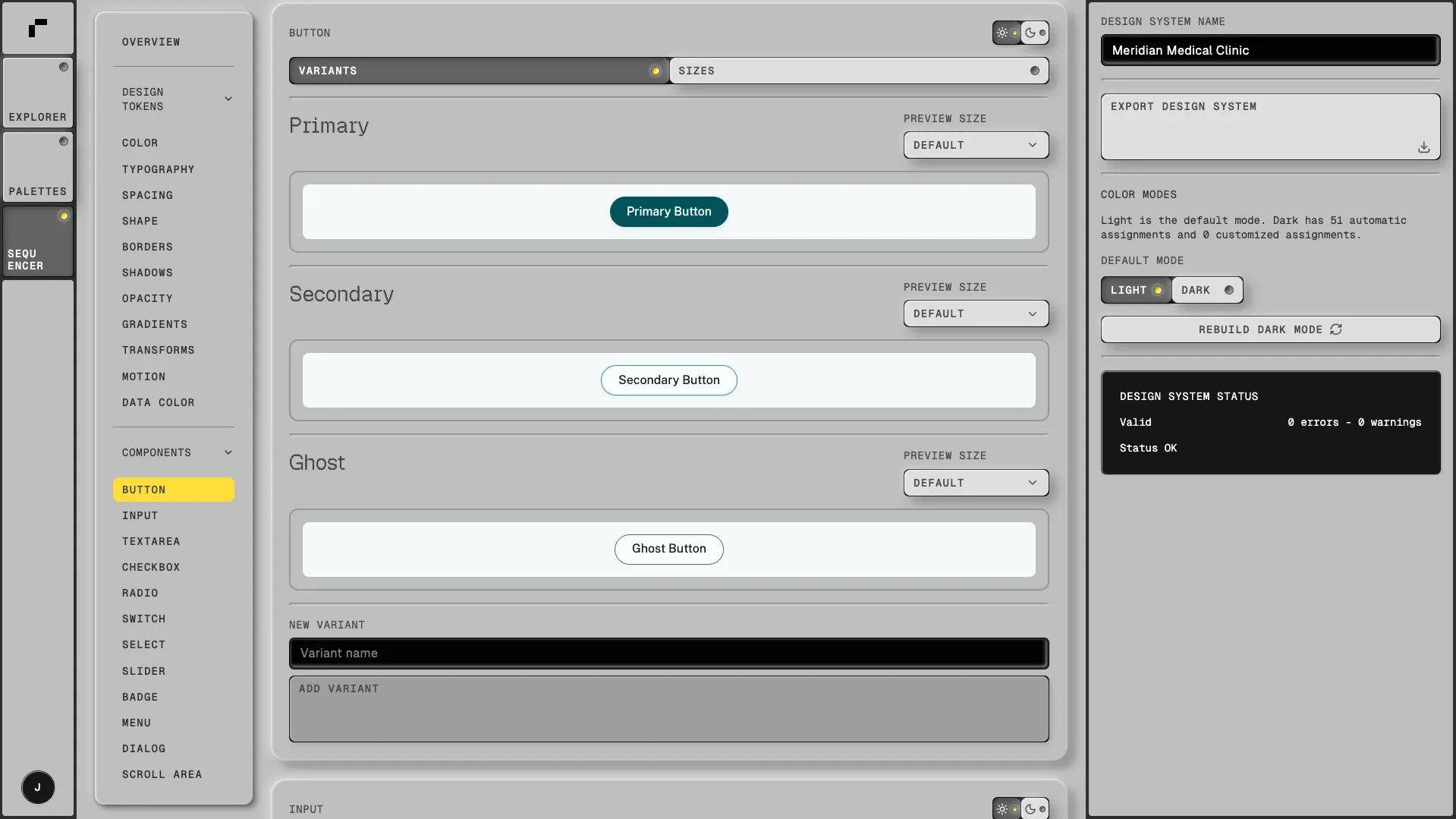
Sequencer's button editor, showing primary, secondary, and ghost variants.

Pinecone Bakeshop

Branding and website for a popular Los Angeles bakeshop and cafe

Before Pinecone was Pinecone, it was Hangry Bakery, a beloved LA pop-up crafting seasonal fruit tarts and baked goods. As they prepared to open their first brick-and-mortar bakeshop/cafe, I helped them develop a brand that was ready for their next stage of growth.

I created Pinecone’s wordmark, logos, refined their color palette, and compiled it into a brand system that they could use on their website, in restaurant, on signage, merch, and more.

I built Pinecone’s website with Astro, and filled it with plenty of non-orthogonal touches and joyful animations powered by GSAP. The site stays true to Pinecone’s playful and funky vibe, but also presents a polish that reflects the serious culinary and business cred of the team behind the bakeshop.

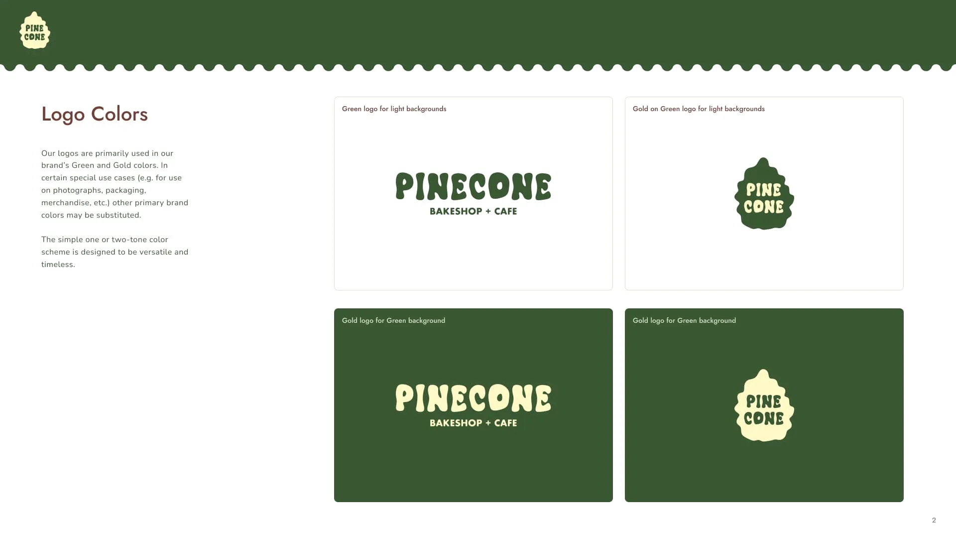
Brand guidelines page showing the Pinecone logo in its green and gold color pairings.
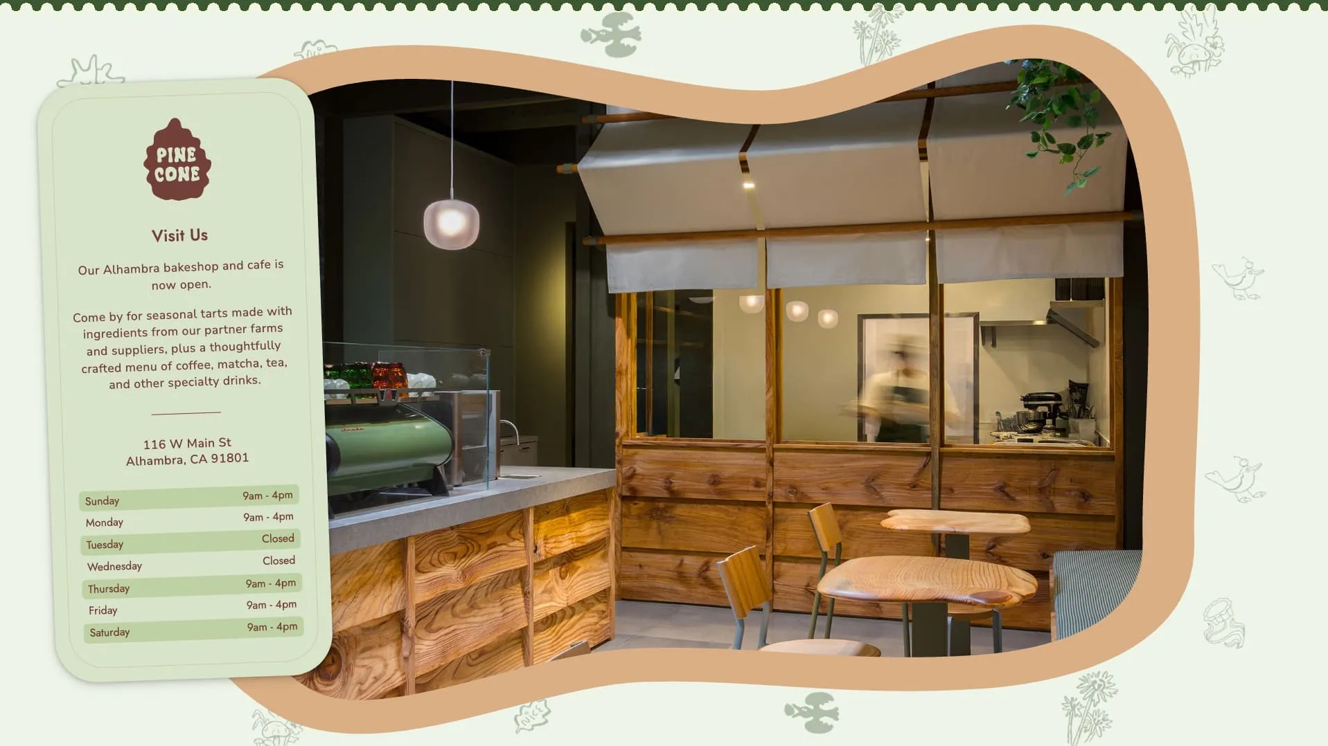
The Pinecone website homepage, announcing the Alhambra bakeshop opening.
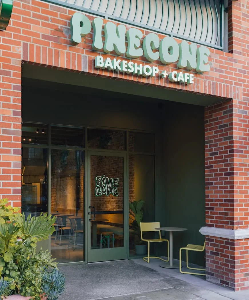
The Pinecone storefront, with the dimensional wordmark sign above the entrance.

Mousterian

Branding and website for a liquid-cooled data center company

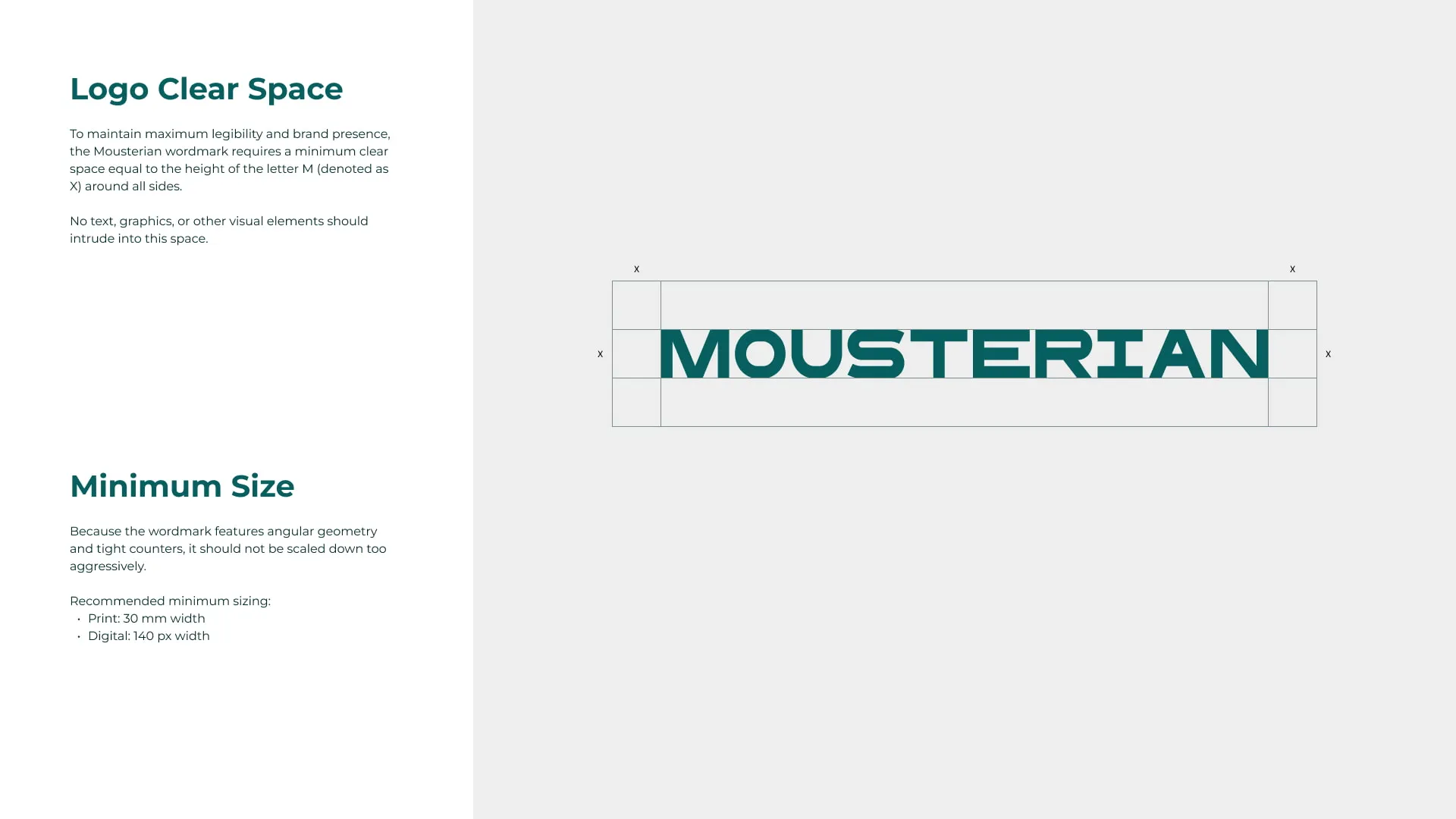
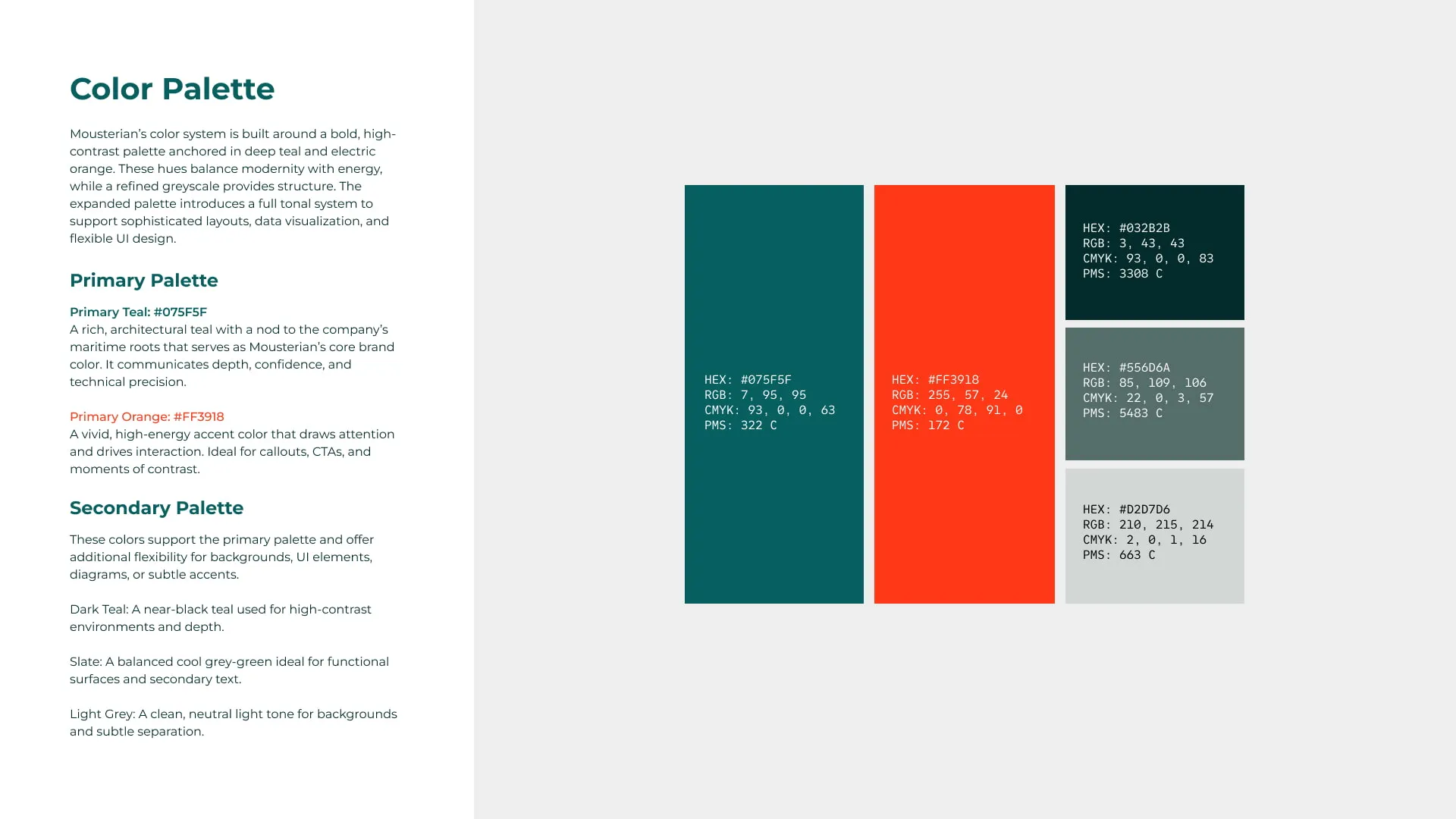
I created Mousterian’s brand from scratch as they were exiting stealth and preparing for the public announcement of key partnerships. I prepared Mousterian’s complete brand guidelines, including custom wordmark logo, color system, font selection, type scale, and usage do’s and don’ts.

I designed and built Mousterian’s website on Astro with interactive WebGL/Three.js elements and fluid GSAP-driven animations throughout. I also developed a custom image transformation pipeline to apply a consistent technical/dithered effect to Mousterian’s assets.

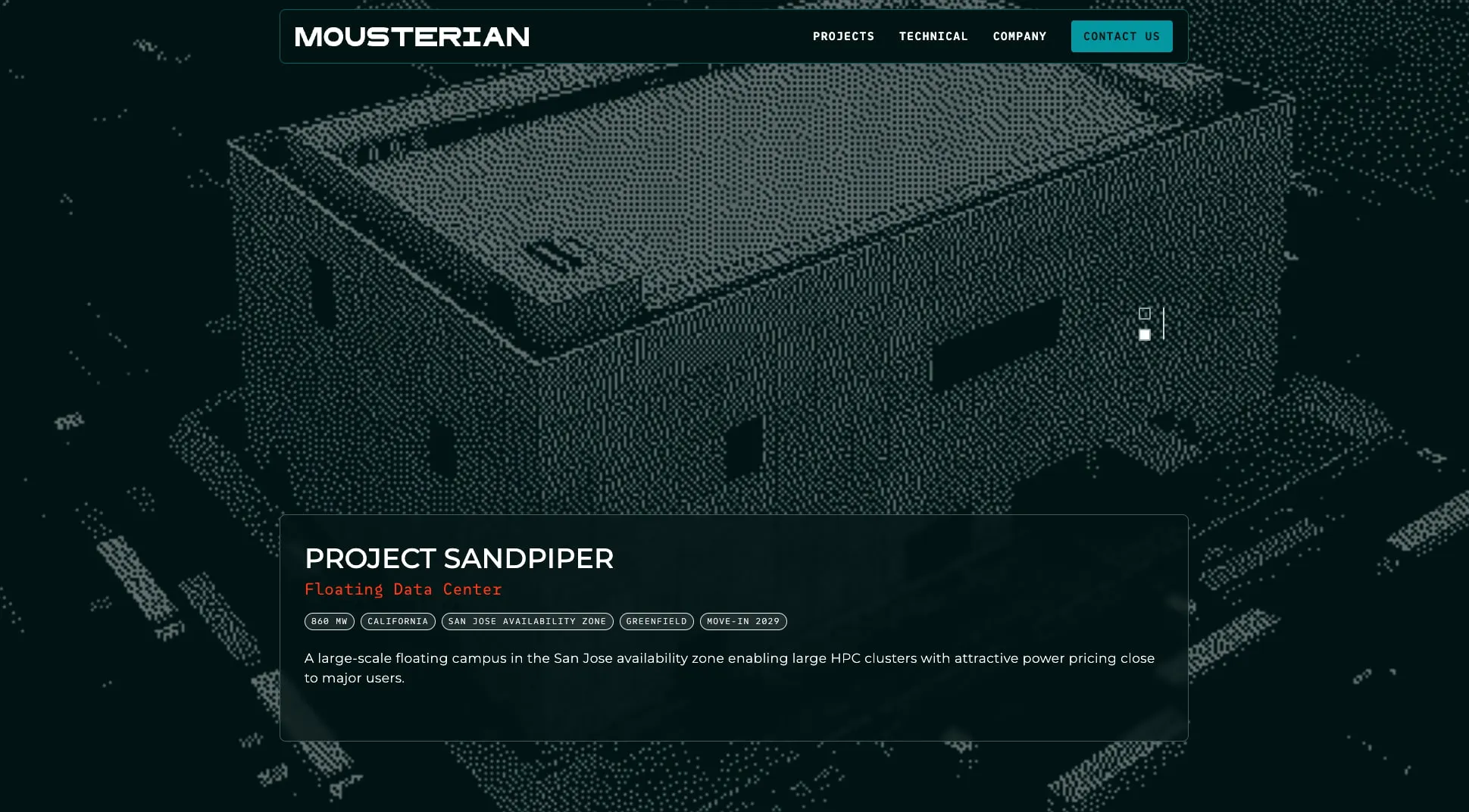
A Mousterian project page for Sandpiper, a floating data center, over a dithered render.
Brand guidelines page specifying the wordmark's clear space and minimum sizes.
Brand guidelines page for the color palette, built on deep teal and electric orange.

KA KA Studio

A portfolio site for a NYC-based creative food agency

KA KA Studio’s founders Irene and James had an established brand direction and following when they came to my partner and I at Elio (studioelio.com). We designed and built the new digital home for their creative food agency, which needed a way to showcase their amazing work: partnerships with national brands, a James Beard Award-winning cookbook, viral content creation, and more.

We helped translate their brand and color scheme into a design system that was ready for the web, and built their site on Webflow. Dynamic and extremely playful were the core themes - expressed by bouncy animations and bubbly fonts and UI elements. We also ensured that all content was properly structed and CMS-driven to make it easy to add future work to the site.

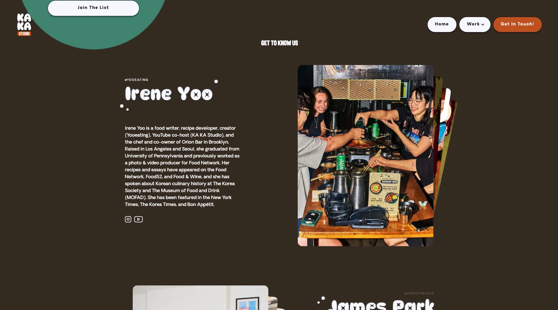
The founder bio section, introducing Irene Yoo alongside a photo of her work.
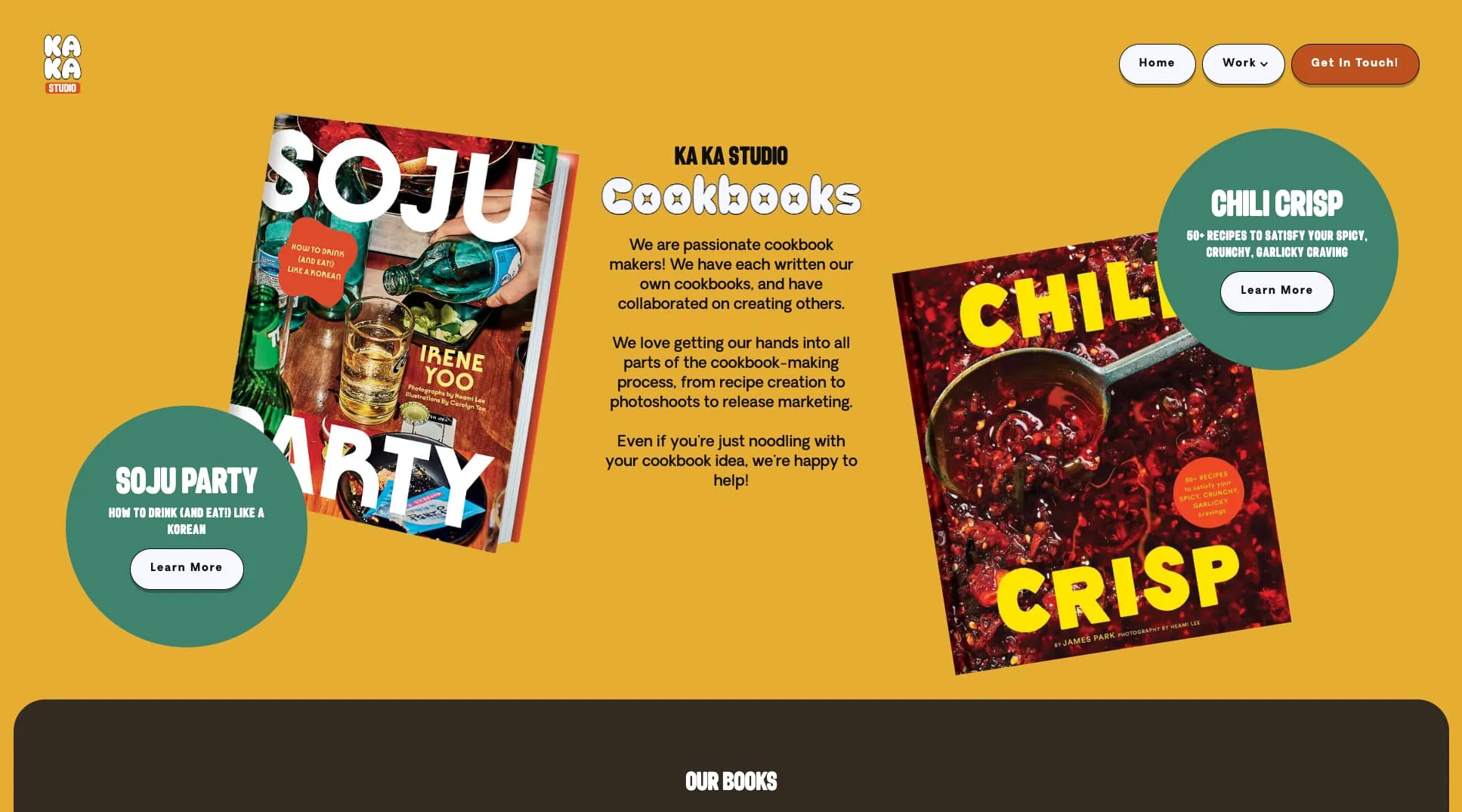
The cookbooks section, featuring the Soju Party and Chili Crisp covers.

Hygge Apps

Brand refresh and custom Shopify build (plus extras) for a hardware startup

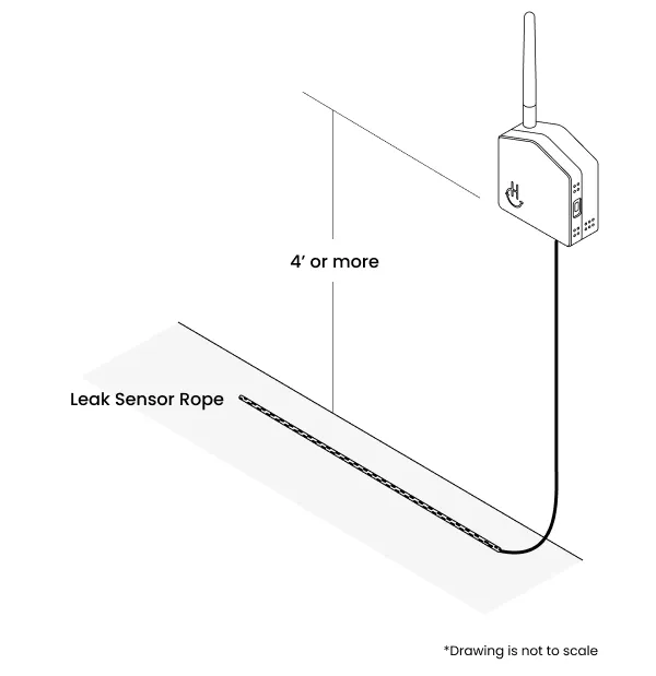
I partnered with Hygge Apps as they brought their environmental sensor hardware to market. The work was multi-faceted, including brand refinement, custom Shopify build, positioning, messaging, and copy, plus product photography and technical diagrams.

Thanks to my architecture background and experience in digital fabrication, I was also able to help with industrial design improvements to the hardware itself. I redesigned the device enclosure to support the evolving electronics and prepared the models for higher volume manufacturing.

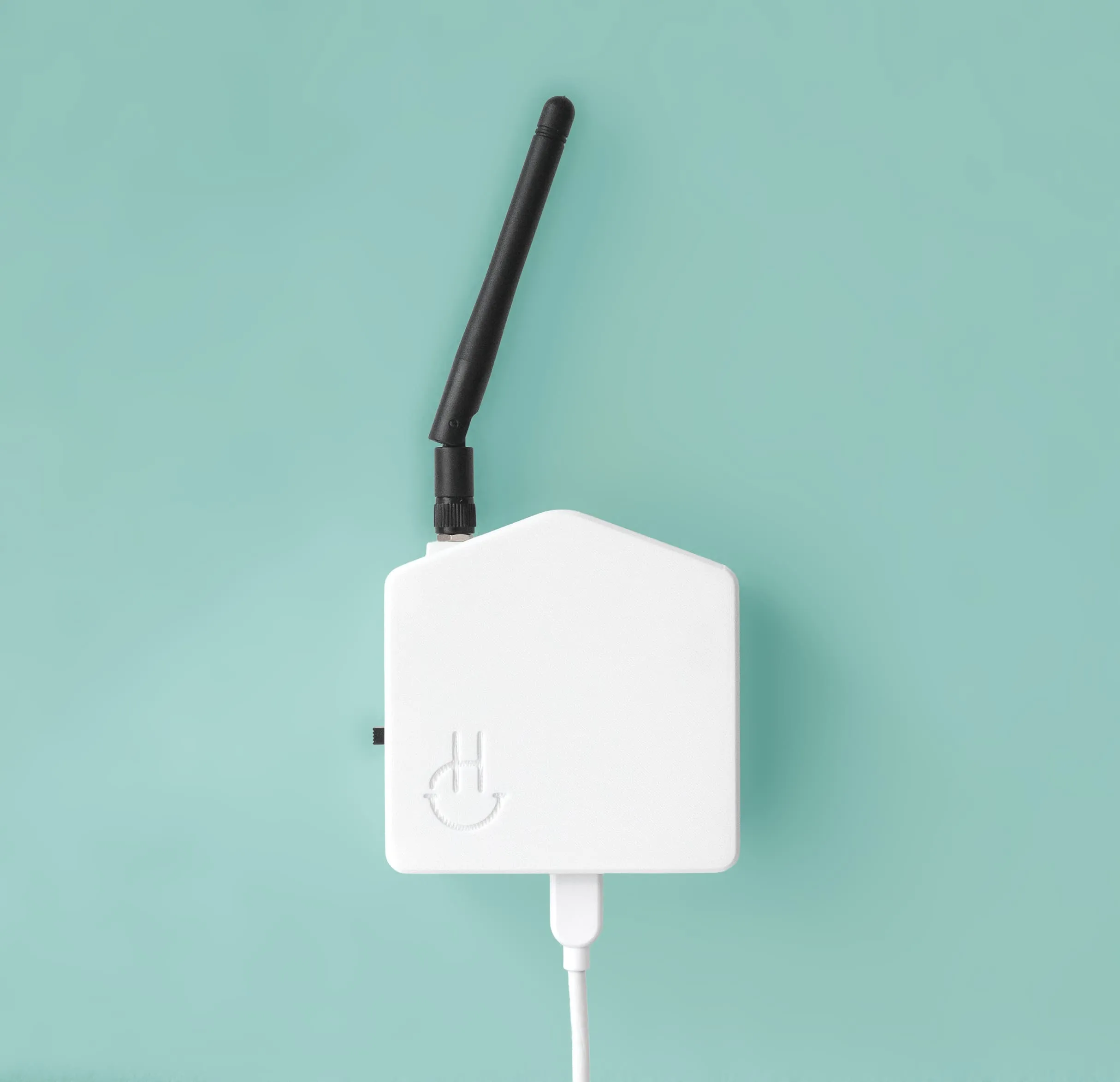
Product photograph of the sensor, antenna raised, on a teal backdrop.
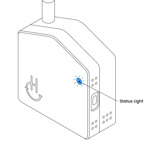
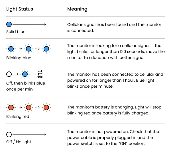
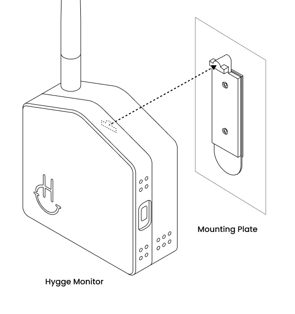
Diagram calling out the status light on the front of the sensor.Exploded diagram of the mounting plate, velcro, and adhesive against a wall.Table explaining what each status light pattern means.Diagram showing the leak sensor rope installed below the mounted sensor.
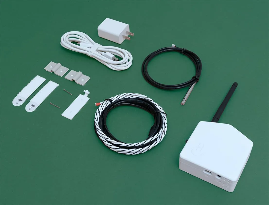
Knolled product photograph of everything in the box, from the sensor to the mounting hardware.

Hayden Capital

Redesign and rebuild for a global investment firm's website and content system

I partnered with Hayden Capital to redesign their website from the ground up. I refined their brand into a more flexible color system, and rebuilt their site on Astro (previously on Wordpress).

I also migrated their existing content library of investor letters and research materials to Sanity and Cloudflare R2, and built a custom UI for browsing, filtering, and downloading these materials. The move from Wordpress to Astro resulted in site load times over 3x faster than before, even with the immersive WebGL scene and elegant animations that fill the page.

The refined color system, laid out as tonal scales of blues and warm neutrals.
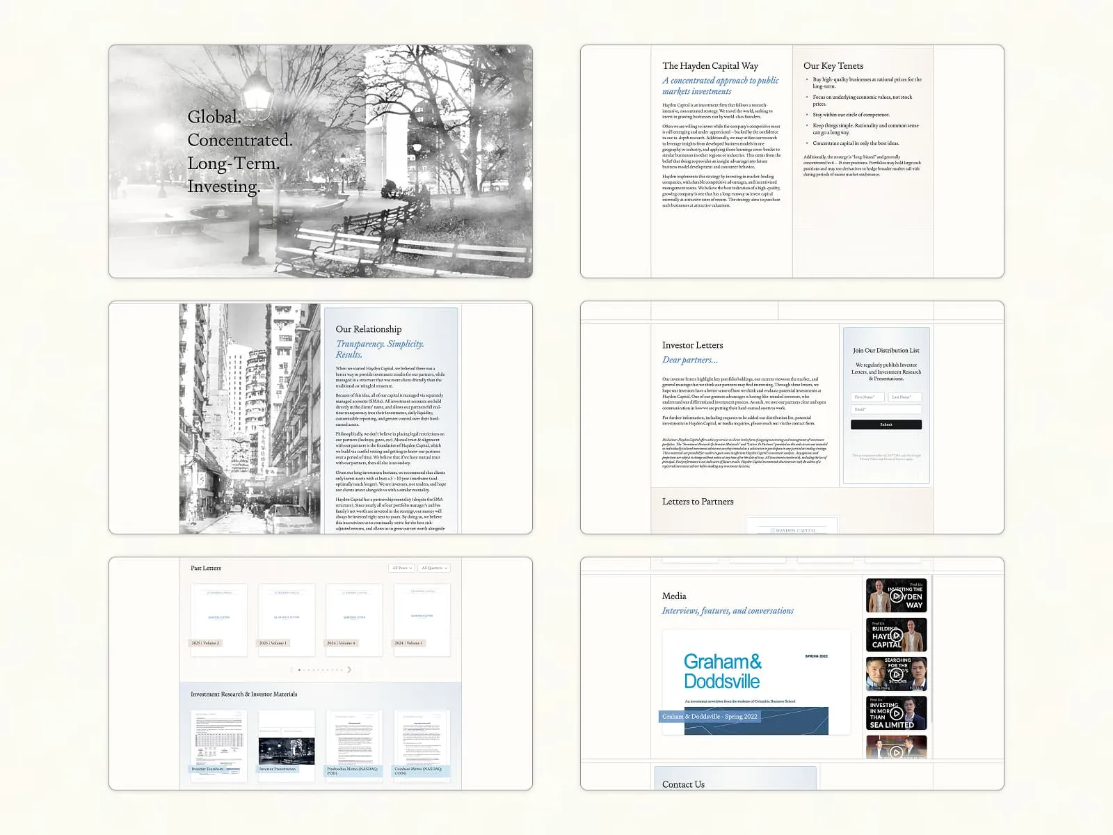
A grid of page designs from across the site, from the hero to the investor letter library.

Elio

Home of my design and development studio

Elio is a design and development studio co-founded with my partner Sonia with the goal of building ambitious projects. Before Elio, I worked in product in NYC for about a decade. In these roles at small, fast-paced tech startups, I wore a lot of hats: designing product UI in Figma, writing design system css, speaking with customers, conducting user interviews, and of course, launching products.

With this experience and context we started Elio. Elio’s core values are a passion for craft, a love for playful and tactile design, a systems-oriented mindset, and a rigor that says “good enough” is not good enough.

We’ve been lucky enough to work with many awesome and creative clients, and some of the work is featured above on this page.

Three mobile screens from the Elio site, from the homepage to the founder bio.